
A collection page is a browse surface, not a second homepage. Shoppers arrive from navigation, search, ads, or internal links and need to scan products, understand the set, and open a product they can buy. Creating the collection in admin is a different job from designing the template. Build the set first: how to create collections in Shopify. Shopify’s current admin labels move; the merchandising work does not. Field-level collection types and conditions live in Shopify Help Center: collections.
This article is layout and merchandising. Indexing, search listings, and thin-content risk are covered in the operator guide Shopify SEO checklist for category and product pages.
Quick answer
Open Online Store → Themes → Customize, pick the collection template, and design for a phone first. Put a unique heading and a short, factual intro above the grid. Sort so the products you actually want to sell appear first. Show a real empty state when a filter or collection has no matches. Turn on storefront filters only after products have consistent options and tags. Do not paste the same paragraph onto every collection. Do not treat a 40-product dump with no copy as “done.”
What a collection page is for
The page answers three questions: what is this set, what is in stock that matches me, which card should I tap. It is not a blog post and it is not a dumping ground for every SKU. If the collection exists only because a theme demo had “Summer,” delete it or fill it with products you will fulfill. Catalog structure starts when you add products with honest types, vendors, and options.
Manual collections give you merchandising control. Automated collections save time when rules are true (product type, tag, price). Mixing both is fine if you understand which products can appear twice in the same menu. Duplicate cards in adjacent collections confuse people more than they help SEO.
Unique copy at the top (not thin filler)
Write a heading that matches what the shopper clicked. Then 2–4 sentences that only this collection can say: who it is for, what is excluded, how sizing or materials work for this set. That is enough. Repeating the brand slogan on every template is thin content in the sense search engines and humans both skip it.
Do not hide the grid below a long essay. Mobile shoppers need products in the first screen or two. Put extra education (fit guides, fabric care) on a page or in the product template and link it. Theme section order is in how to customize a Shopify theme. Admin UI for the theme editor changes; look for the collection template, not a memorized click path.
If two collections share products, intros still need different jobs (for example “Work shirts” vs “Travel shirts”). Identical copy is a duplicate-page problem. The SEO checklist covers canonicals; design’s job is to make the page worth indexing.
Merchandising the grid
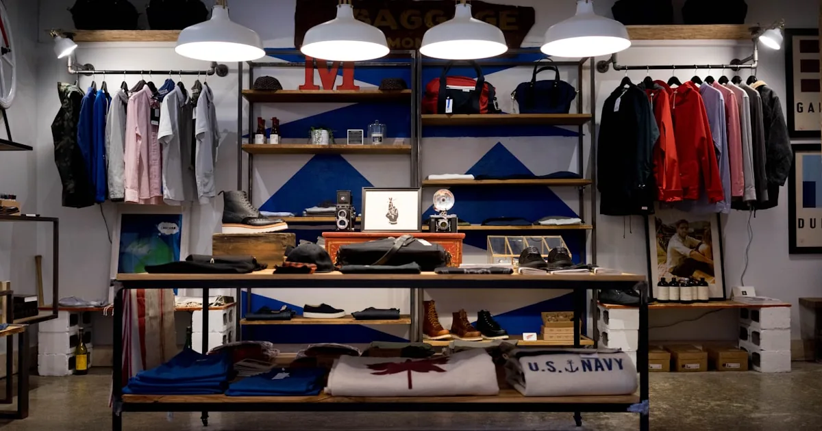
Product cards should show a clear image, title, price, and sale state if you use compare-at prices honestly. Crop and aspect ratio belong in theme settings so cards line up. A lifestyle shot that hides the product is a homepage trick, not a grid trick.
Sort. Manual order is merchandising: best sellers, newness, or the SKU you can actually ship. Alphabetical and price sort help some shoppers; they are not a substitute for a default that matches how you sell. If “Best selling” is empty because you have no orders, do not leave it as the default. Shopify’s available sort options depend on the theme and on how the collection is built—confirm in the editor and in Help Center, not in a YouTube video from 2019.
Stock. Out-of-stock cards that still look buyable create dead taps. Hide, badge, or send them to the end, depending on what your theme supports. Do not advertise a collection as “in stock” in the intro if half the grid is sold out.
Density. Two columns on phones is the usual readable grid. If cards wrap titles or truncate prices, that is a theme choice problem, not a merchandising app.
Sort, filters, and empty states
Filters let shoppers narrow by availability, price, and product options. Shopify documents storefront filtering and the Search & Discovery app. Compatible themes expose a filter setting on the collection product grid. If your theme does not support filters, creating them in the app will not show them on the storefront. This page is a teaser: a later Shopify 101 lesson covers filter strategy in full. For now, add only filters whose values exist on the products in that collection. Twenty unused color filters is noise.
Empty states. A filter combination with zero products needs a sentence and a way out: clear filters, a related collection, or a search. An empty new collection (no products assigned) should not ship on a live menu. If you must publish a coming-soon set, say so and link to a collection that has inventory.
Pagination vs infinite scroll. Either can work. If you use infinite scroll, keep footer policies reachable and do not trap the Back button.
Collection page vs homepage vs product page
The homepage sells the store. The collection sells a set. The product page sells one decision. Do not clone homepage hero videos onto every collection. Do not put the full product description on the card. Keep the path short: menu → collection → product → cart. That path is the same idea as designing a store that converts: fewer dead ends, not a promised conversion rate.
Common mistakes
- Using one global collection description on every template.
- Putting “Lorem ipsum” or manufacturer catalog prose above the grid.
- Default sort that buries the products you can fulfill.
- Enabling every filter because the app allowed 25.
- Linking a collection in the menu before it has products.
- Treating collection design as a substitute for creating collections with real rules.
What to do next
Assign products, write unique intros, set default sort, and preview the collection template on mobile in the theme editor. Then walk product presentation on a sample SKU. The Shopify 101 hub and the Shopify 101 category map the rest of the storefront sequence.
You can merchandize collections without an agency. Theme section work is optional help from AalphaLeo Digital Solutions (+91 9288621081) if the template cannot show a usable grid. The copy and product order stay yours.
Frequently asked questions
How long should collection copy be?
Long enough to be unique and true. A short paragraph plus a heading beats a 600-word essay that pushes the grid down on a phone.
Should every collection have filters?
No. Tiny collections (a handful of products) often need sort and good cards, not a filter rail. Add filters when shoppers cannot scan the set.
Manual or automated collections for design?
Use manual order when sequence matters; use rules when the catalog is large and the rule is accurate.
Does collection design replace SEO work?
No. Layout helps humans. Titles, handles, copy uniqueness, and indexing are the SEO checklist. Do both.

AalphaLeo Digital Solutions
Publisher of FACTASH. Practical technology, AI, and search operations writing. No invented credentials.
Publisher pageRelated articles
What Is Shopify? A Plain-Language Explanation for New Store Owners
Shopify is a hosted commerce platform for selling online, in person, and on connected channels from one admin. What it includes, what you st…

What Are Shopify Product Tags and How Should You Use Them?
Shopify product tags are admin merchandising labels for collections, search, and apps—not a ranking shortcut. Naming conventions, what to ta…
What Are Shopify Apps and How Do They Work?
Shopify apps connect to your store via permissions, App Store install, theme embeds, and fees. Native tools vs third-party, scopes, and what…