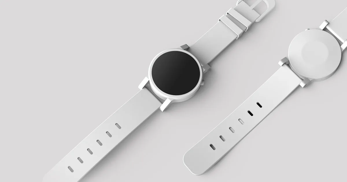
On Shopify, “high-converting” means a product page that lets someone understand the item, pick a real variant, see the price and delivery constraints, and add to cart without hunting. It does not mean a benchmark, a promised lift, or a ranking. Shopify will not publish your conversion rate in the theme editor. You still have to photograph, write, and price honestly. Admin screens for products change; the shopper’s job does not. Product fields and media are documented in Shopify Help Center: products. Adding the SKU in admin is how to add products to Shopify. This page is the template and the decision layout.
If the store itself has no clear path, fix that first: design a Shopify store that converts.
Quick answer
Open Online Store → Themes → Customize, select a product template, and preview mobile. Put gallery, title, price, variant picker, and Add to cart in one glance on a phone. Add a short shipping or fulfillment snippet that matches Settings → Shipping. Link refund and shipping pages. Show related products only after the buy action is visible. Do not stack review, upsell, size-guide, and chat apps until each one has a job. Theme controls differ by theme; confirm in theme customization.
Gallery that answers the product
Lead with a sharp image of the actual item. Additional images should rotate, show scale, and show the variant the shopper selected if your theme supports variant media. Lifestyle shots help after the product is recognizable. Blurry marketplace downloads train people to bounce. Alt text is for accessibility and context, not keyword stuffing; the SEO checklist for product and collection pages covers listings. Design’s job is: can I tell what this is in one second on a small screen.
Video is optional. If you use it, do not autoplay with sound. Do not replace the first still image with a 20 MB clip that stalls the add-to-cart button.
Price, compare-at, and the variant picker
Price must sit next to the buy action. Compare-at pricing is a discount claim: use it only when the compare-at is real in your policy. Hidden fees that appear only in cart are a trust problem, not a “conversion tactic.”
Variants. Size and color belong in a picker the shopper can complete before add to cart. Sold-out variants should look sold out. If choosing a variant changes the image or SKU, the theme must update the gallery. Unavailable combinations should not silently add the wrong SKU. If your catalog uses many options, test the picker on a phone; tiny swatches and truncated dropdowns are a common failure.
One product versus many products: if warranty, shipping class, or description truly differ, they are separate products. Variants are for options of the same item. That modeling choice is product admin, not CSS.
Add to cart, dynamic checkout, and the buy path
The primary button is Add to cart. It must be large enough to tap, labeled clearly, and not competing with three equal buttons. Dynamic checkout (Shop Pay, wallets) can sit nearby when Shopify shows them for your store. They are not a substitute for a working cart and checkout setup. If dynamic checkout is missing, it is usually eligibility or payments, not a missing app.
A sticky add-to-cart bar on mobile can keep the action visible as someone scrolls the description. It should not cover the variant picker or cookie banners. If everything is sticky, nothing is.
Quantity selectors matter when you sell multiples; they are clutter for one-off artisan pieces. Match the catalog.
Shipping snippet, policies, and trust
Shoppers look for “when does this arrive” before they look for brand story. Put a short, accurate line: ships from, typical window, or “rates at checkout” only if rates actually exist. If you cannot quote a rate, fix shipping in admin before you decorate the page. Local pickup must be a real method, not a sentence on the homepage.
Link Shipping, Refund, and other policy pages near the buy block. Trust is specific: return window, who you are, payment marks Shopify already provides at checkout. Fake “as seen in” logos and invented review counts are worse than a short About link.
Reviews help when they are real and dated. A reviews app that delays the page and shows three generic five-star blurbs is not trust. Load reviews after the buy block, not instead of it.
Related products and what not to bolt on
Related products belong below the fold or after add to cart is understood. They should be in-stock, relevant, and not a second merchandising dump. Collection context (the set they came from) is often more useful than a random “you may also like” app. Collection design is covered in Shopify collection pages.
Do not install four upsell widgets on one template. Each app script costs attention and often speed. If you need a structured test plan later, use Shopify CRO growth framework as an operating model—not a promise that a section will “add sales.”
Theme choice still matters: a paid theme with a broken product template is worse than a free theme with a clear gallery. See how to choose the best Shopify theme.
Common mistakes
- First image that does not show the product.
- Add to cart below a long story on mobile.
- Variants that do not match inventory.
- Shipping claims the rate table cannot fulfill.
- Compare-at prices that were never the selling price.
- Calling the page “optimized” because an app badge said so.
What to do next
Pick one live product. Preview the product template on mobile and desktop. Complete a variant selection and add to cart. Fix gallery, price, picker, and shipping snippet before you touch apps. Then check the cart page and mobile layout.
If the theme cannot present gallery, variants, and buy actions clearly—or you need a product-page redesign with custom sections—AalphaLeo Digital Solutions does Shopify design, theme development, and storefront redesigns. Phone / WhatsApp: +91 9288621081. Bring a real SKU and a list of blockers (not a target conversion percentage). Product photos and prices remain your work.
Frequently asked questions
How many images does a product need?
Enough to show the item, key details, and variants. Five honest photos beat twenty near-duplicates. Shopify’s media limits are in Help Center; do not upload huge files that stall the page.
Should I use a size guide app?
Use a page or a theme block if sizing is not obvious. An app is justified when the guide is complex and you will maintain it. A PDF buried in the description is easy to miss on a phone.
Do I need tabs for description, shipping, and reviews?
Only if the theme makes a long page unreadable. Tabs that hide shipping on mobile often hide the information people need before they buy. Visible subheads can be clearer.
Will a new theme raise conversion?
A clearer path can remove blockers. A new theme can also break variant media and slow the page. Redesign for a stated UX problem, not because a theme is on sale.

AalphaLeo Digital Solutions
Publisher of FACTASH. Practical technology, AI, and search operations writing. No invented credentials.
Publisher pageRelated articles

What Is Shopify? A Plain-Language Explanation for New Store Owners
Shopify is a hosted commerce platform for selling online, in person, and on connected channels from one admin. What it includes, what you st…

What Are Shopify Product Tags and How Should You Use Them?
Shopify product tags are admin merchandising labels for collections, search, and apps—not a ranking shortcut. Naming conventions, what to ta…
What Are Shopify Apps and How Do They Work?
Shopify apps connect to your store via permissions, App Store install, theme embeds, and fees. Native tools vs third-party, scopes, and what…